
- We need to move on from basic influencer identification based on Twitter bios, to finding people based on their network connections.
- Drawing networks on NodeXL can visually communicate the meaning of relevance in influencer identification to senior stakeholders.
- And we can use conversational data from influencer networks to inform and evaluate content strategy.
Let’s look at basic influencer identification first. When we’re trying to find influential people around a key topic, we’re likely to search Twitter bios for related keywords, to search Twitter conversations, maybe using buzz monitoring software like Brandwatch, and to search blogs based on the title and content of the blog. Once we’ve got a list of potential influencers, we’re likely to filter and prioritise them based on things like follower count, Klout score, MozRank or inbound links. This often produces quite a good list of influential people around a topic.
Followerwonk is one of the tools we use to get lists of tweeters based on bio keyword, location and social authority. Twiangulate is another. We can export these lists to use in other tools. At Brilliant Noise we’ve built our own Twitter API tool to produce CSVs of various datasets I need for influencer mapping. The most basic allows you to input a user list, and export bios, links and follower counts.
So when we do basic influencer mapping like this, the results are useful. We find:
- self-proclaimed experts and obsessives who’ve defined themselves as interested in the topic at hand;
- highly vocal people around a key topic;
- people who are generally influential online.
However, this initial list doesn’t necessarily give us people who are influential around the key topic. For example, I might have gained a high Klout score and lots of followers as a result of me talking a lot about feminism … but when I talk about data perhaps my feminist influence is irrelevant. So while I’ll come up in a search for data because it’s in my bio, and I have a reasonable number of followers, I’m not necessarily influential about data. Obviously I hope I am, but the evidence isn’t there yet…
Advanced influencer identification step 1: prioritising influencers by number of relevant topic mentions.
Take a basic influencer list and see who actually talks about the relevant topics the most, e.g. take people with ‘data’ in their bio, and look at how much they talk about data related topics, using Brandwatch. Then we get an ordered list of our authors based on how vocal they are about the topic, and they’re already filtered by people who describe themselves as being interested in the topic, and are influential online.
An improved measure of influence/relevance: network follower count. The number of connections within a network of influencers.
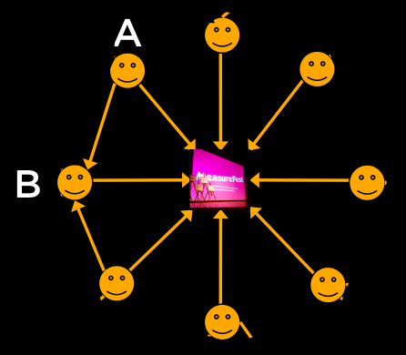
Say we take all the followers of @measurefest. We can create a network with just these people in it, and see who follows whom. By counting followers just from within this network, we create a ‘network follower count’. So for example in this diagram, person A is not followed by anyone in the primary network, so gets a score of zero. Person B is followed by two other followers of @measurefest, so gets a follower count of 2.
So let’s look at how we can improve on this method. Consider running initial influencer identification as you would normally. Then consider who else is influential to your initial list? Who do they follow? And who is particularly interested in your list – who follows them? We can then prioritise not only on number of relevant mentions, but also the likelihood to be followed by or follow the initial influencer list.
Drawing networks on NodeXL to visually communicate relevance to senior stakeholders.
Moving on to the actual mapping bit. This can really engage senior stakeholders by visually communicating relevance of influencers within a network.
NodeXL is a free, open-source template for Microsoft® Excel® 2007, 2010 and 2013 that makes it easy to explore network graphs.
With NodeXL, you can enter a network edge list in a worksheet, click a button and see your graph, all in the familiar environment of the Excel window.
Here’s an example. First, let’s get all the followers of @measurefest. I did this using our own tool but there are others out there you can use, or use the Twitter API directly.
In Excel, after you’ve installed NodeXL, Import from Twitter List Network. Paste in the list of followers and choose ‘follows relationship’.
First we get the whole Measurefest network map which is so big it’s quite useless visually. I added a factor to increase node size based on follower count, but it’s still unusable. We need to filter it.
So then we apply a network follower count to all of @measurefest’s followers, and filter by this.
Filtered by the count of how many follows WITHIN THE NETWORK each node has, so each remaining node has at least 20 ‘network follows’. This shows those who are highly connected, and so highly influential within this network.
Who ELSE is influential to @measurefest followers?
So far we’ve mapped a very simple network with one central node – we’ve mapped the orange part of this diagram. What could be interesting would be who else is influential to this inner network, who isn’t already following @measurefest?
The Twitter API calls people who you follow ‘friends’. So, if we input the top followers of @measurefest based on their @measurefest network follows, we then want to grab everyone they are following. You might also do this with a wider range of influencers who you’ve identified in the normal way. For demonstration purposes I’m just using the @measurefest network.
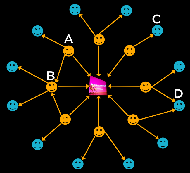
Network follower counts:
- A = 0
- B = 2
- C = 1 Followed by one of @measurefest’s followers
- D = 2 Followed by two other followers of @measurefest
We can then take our initial list, and those with the highest number of network follows, and re-draw our network diagram. Now we have a more robust illustration of our influence network, including people not currently following @measurefest.
When the primary influencer list is broad, @stephenfry normally comes up as top by network follows.
So, calculate network follows as a PERCENTAGE of total followers, to get a more reliable relevance score
Now we’ve got our primary list of influencers and everyone they follow. I’ve then added another network follower count, which counts within this second tier of tweeters, how many of our primary list follow them, i.e. how relevant is the larger list to the primary list?
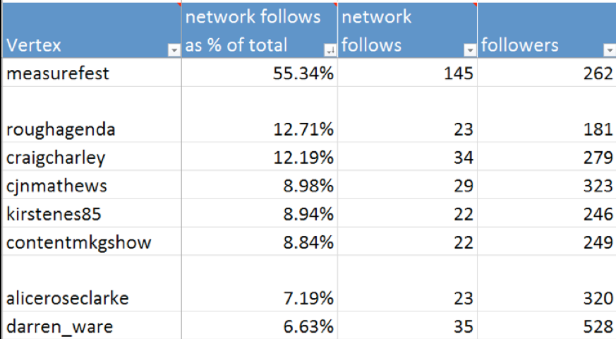
If we had a broader input list, we normally find Obama and Stephen Fry in this list. Which isn’t particularly useful because they’re not likely to be used for outreach purposes, and aren’t particularly relevant to our selected influencers. So, we then calculate network follows as a percentage of total follows – this will give us a better relevance score because it’s proportional to total fame. When we do this, the more generically ‘famous’ individuals drop down.
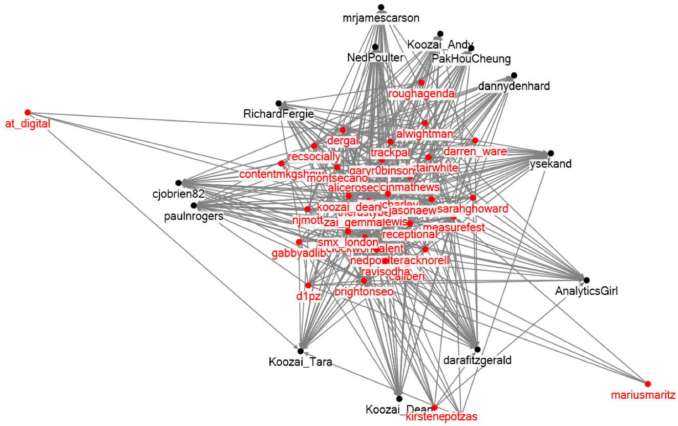
So now we have a filtered network diagram, showing the most influential followers of @measurefest, and the people most followed by this group, as a proportion of total followers. So this is quite a reliable influencer network diagram. To a senior stakeholder, they can see immediately the closeness of this network, and how well connected all of the influencers are, which works much better than a spreadsheet with Klout scores on.
Using conversational data from influencer networks to inform and evaluate content strategy.
Use an author based query (not keyword based) to grab everything they’re saying (e.g. our primary @measurefest influencer list). Then without bias, we can see what topics are being discussed right now amongst this group. This can then be used to inform content planning decisions.
Inform:
- What are your target audience / influencers talking about?
Evaluate:
- Have you managed to influence the conversation with your content?
- What volume of mentions from your target audience relate to your content?
Basic influencer identification
- Finds generally influential people online
- Who define themselves as experts, or talk a lot about a topic
Advanced influencer network mapping
- Considers the relevance of an influencer within a niche network
- Creates a visual to illustrate the value of the method to senior stakeholders