
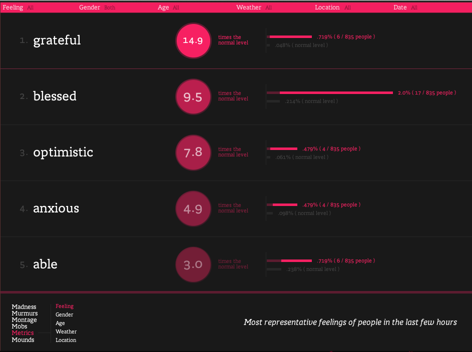
Screenshot from wefeelfine.org
I’ve always loved data, charts, graphs and illustration. So of course I love infographics. Good infographics that is. I’ve always been one of those people who gets annoyed at faux infographics, like badly illustrated text claiming to be an infographic. So I thought I’d better make sure I knew what I was talking about and understand what is and what really isn’t an infographic.
Wikipedia definition:
“Information graphics or infographics are graphic visual representations of information, data or knowledge intended to present complex information quickly and clearly”
So, that’s pretty broad.
That includes maps, simple bar charts, word clouds. It doesn’t have to be some flashy interactive designer illustrated thing. In fact, cave paintings can sometimes be considered to be infographics. An early infographic that made a difference was one in 1857 by Florence Nightingale, persuading Queen Victoria to improve conditions in military hospitals, through the Coxcomb chart, a combination of stacked bar and pie charts, depicting the number and causes of deaths during each month of the Crimean War.
Back to the Wikipedia definition of an infographic:
…”They can improve cognition by utilizing graphics to enhance the human visual system’s ability to see patterns and trends.”
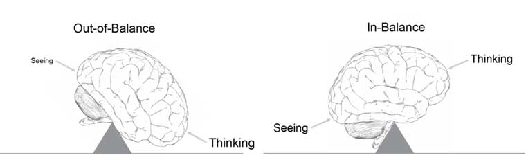
Source: Few, 2010
So this is the interesting bit, and where many infographics fail.
The reason infographics are useful for marketing is that they can summarise your key messages better than any sentence, and make it easier to get those messages into people’s heads. If they’re not making it easier, then all they’re doing is creating an illustration to accompany your message, and you’re going to have to spell it out to people in text anyway. The latter might improve sharability vs not having any image, but it won’t aid understanding of the message by its readers.
What follows are some of the techniques infographic artists can use to accomplish this task – to make cognition easier through graphical means. Without these, it really isn’t an infographic.
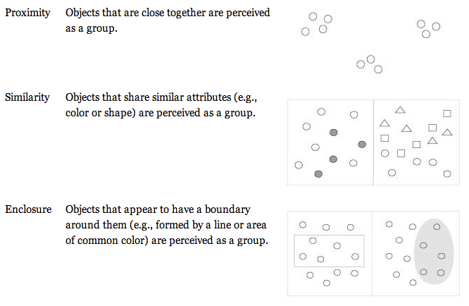
Source: Few, 2010
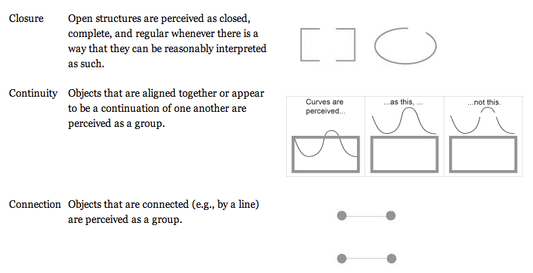
Source: Few, 2010
So, when you need to commission an infographic, make sure your designer understands these principles. It’s not just straightforward illustration, making something look pretty. It’s about designing for understanding.
You’ll also need a designer who is good at data analysis. Or, you’ll need to have done the data analysis already. In my experience, many designers will suggest they’re happy to be provided with a spreadsheet and to illustrate the key points, but it’s very rare that that will work well. You may have worked with the designer many times before on other design projects, but if you’ve never asked them to create an infographic, be aware it is not as easy as it seems. A specialist skillset is required to analyse and interpret data, to make it into something meaningful, to weave a story and insights from a table of numbers. And then to use the good graphical techniques to turn it into an infographic.
If you already have your key points from the data and you know the statements you want to illustrate, and you don’t have an infographic artist available (they are unfortunately quite hard to find), consider doing wireframes for the infographic, and providing those to any good digital designer, as you would with a website. That way there’s less room for misinterpretation of the data.
Finally, consider that if your data is too basic, it will be very hard to make the infographic very good. It will feel a bit pointless and over-designed if you only have three simple statistics.
Comparative statistics work well, as do trends over time. One-off stats not related to each other are more difficult.
That said, if you still want to create a graphic with some simple stats in, that has nice illustration, that’s fine too. It can certainly make the stats more shareable and nice to look at online or in print. But maybe don’t consider it to be a fully fledged infographic!
Some classic examples of infographics I like:
Research centric

Lauren Manning, a New York based designer, explores various methods to visualise one single data set for her thesis, Food Consumed:
“It’s like comparing apples to oranges.” This phrase is the best way to describe the current state of data visualizations. …Instead of seeing many excellent visualizations of all different data sets, what if you could see tons of visualizations of the same data set? What new comparisons, knowledge and structure might be developed from this?
Customisable & with public data
https://www.informationisbeautiful.net/play/snake-oil-supplements/
Attributed to multiple sources
- wefeelfine.org
- The options for information visualisation are vast. So much so that someone’s created a periodic table of them. (Meta!)
What are some of your favourites?